
Hey guys! I recently spoke with Phoenix-based multi-housing rehab studio Nuviro for their Interior Designer Chats series—check out the interview here! Learn about my favorite things, get some home advice, and find out which huge design mistake I see most often.
trends

Color Me Impressed—New Trends in Interior Design /
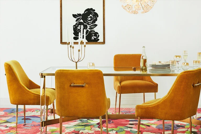
Image: Anthropologie
For a few years now, a crisp white background with color or neutrals layered over it (very Scandinavian) has been all the rage in interior design. I still adore this more minimal scheme, but lately, I'm noticing a shift toward something a little more unconventional—a sort of late '60s/early '70s French bohemian palette—and I am totally digging it.

Image: mygardenlife.com

Image: Charlotte Lapalus
Colors
Chartreuse
Marine Blue
Forest Green
Mustard
Cornflower blue
Poppy Red
Blush Pink
Tangerine
Apricot
Cerulean
Hunter green

Image: Jen Peters
At first glance, the colors may seem to be paired somewhat haphazardly, but on closer inspection, they truly compliment one other quite nicely. It kind of reminds me of Alice in Wonderland honestly—and it’s rad.
Typically, we associate certain colors with specific seasons, but this look combines them all and pulls it off really well. The pinks and oranges keep the look cheerful, while the blues and greens ground the palette. The mustard keeps it optimistic.

Image: Anthropologie

Image: Anthropologie
The palette can be used for anything from a really bold, boho hippy look to a more restrained classic French look, and it works well with both. The key is to balance the solid colors with the patterns, keeping more than 50% of the surfaces solid. The more patterns you layer, the more psychedelic the look will feel. More restrained patterns and tailored silhouettes will give it a more classic look.
If you're going for the folksy beatnik vibe, pair it with rich neutral textures. Or forego neutrals altogether and use saturated earth tones in their place. For a richer, more rock 'n' roll look, throw in some black, burgundy, or dark plum. I really like to incorporate faded black (anything with a “folk” vibe will work great) to ground the color scheme and make it a little more dramatic. Then, I'll pair it with rough, natural wood and vintage hand-carved accent pieces. Aged brass goes really well too!

Images: Anthropologie
Anthropologie is really honed in on this look right now, and Jonathan Adler has some cool pieces as well. For the cost conscious, World Market and Target both have a lot of great products out right now.